Closing the SNAP Gap

Closing the SNAP Gap
PROBLEM
One out of ten households in Massachusetts struggles with food insecurity as reported by Project Bread in 2019. The DTA had a non-mobile friendly, lengthy online application for their Supplemental Nutrition Assistance Program (SNAP), formerly known as “Food Stamps,” causing many to have visit in the office in person to get help applying. For those with limited access to transportation, difficult schedules, etc. this hurdle can reduce access to dearly needed assistance.
SOLUTION & Role
Massachusetts Department of Transitional Assistance (DTA) brought us on, along with dev partner Conduent, to redesign their online application. We talked to stakeholders, learned about accessible design from experts, prototyped early, and worked with the diligent policy makers at the DTA to redesign the online SNAP application.
I served as the day-to-day project lead and primary designer.
RESULTS
The result was a streamlined, organized, accessible, and mobile-first online application process. The redesigned application was deployed in July, 2018. For the first time ever at the MA DTA, the amount of applications coming from the web is larger than the amount completed in person. Through a simplified and accessible online tool, more people are getting the help they need. This project has been published as a case study in the book "Measuring the User Experience," by Bill Albert and Tom Tullis.
Design
The image below shows what the initial online application looked like. Early in the project, I spent time exploring the entire application, screenshot-ing each page and connecting them in a visual flow to build familiarity.

As we worked on this project, we realized that we could simplify the experience by better organizing the questions and clarifying, and in some cases reducing, the text copy. We worked closely with folks at the DTA to make each of these text changes - and although we didn’t realize that improving the copy could be part of the project, we were amazed to see the difference that it made.
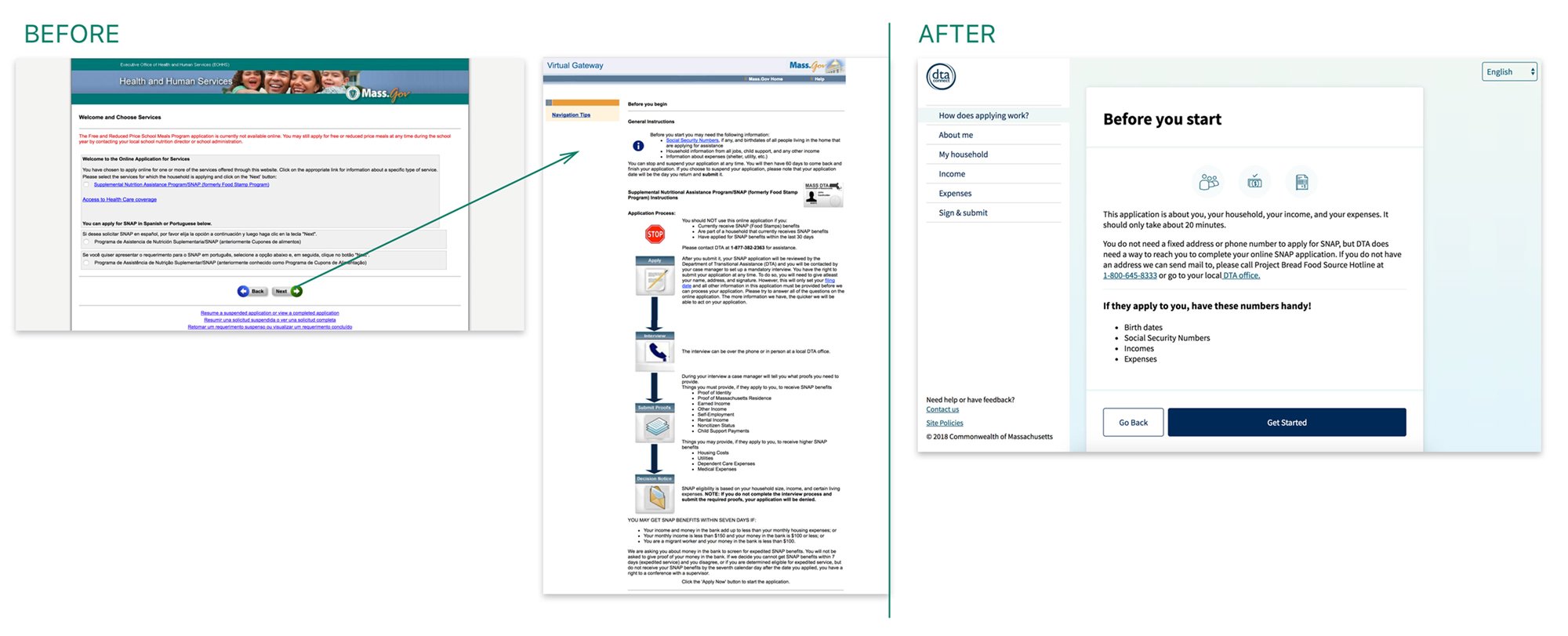
In the image below, you can see the Before and After of the “Before you start” section.

The following poster highlights key design decisions we made in this project. If you’d like to learn more, read the full case study on the GoInvo website here.
